Pragmatic and agile: the development of the Corona-Warning-App website
80 million potential users, one website and very little time - perhaps the fastest go-live in our history.
The task: A scalable website
From UX concept to technical implementation in just a few weeks? Sporty, but not impossible: thanks to a well thought-out multi-stage plan.
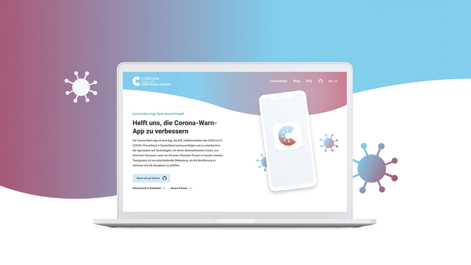
Hardly any other app received more public attention at its launch than the Corona warning app. Developed in record time by SAP and Telekom subsidiary T-Systems, the app was set up according to the open source principle: The source code is publicly accessible, so anyone can participate in the app's further development.
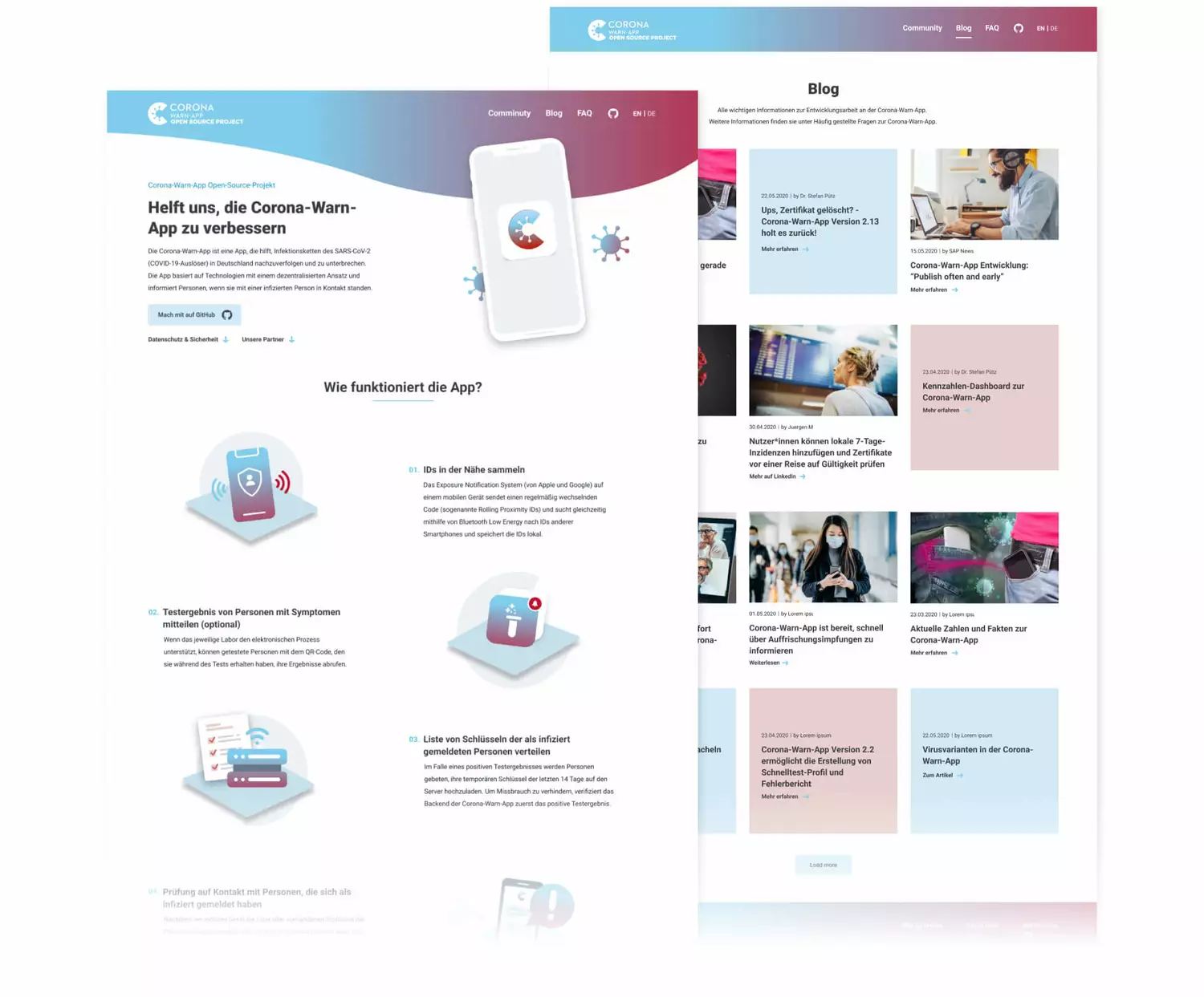
At the same time as the app was released, we launched a streamlined website that explains how it works and focuses on the open-source idea. After a successful go-live, we docked additional features: A user blog and an online dashboard to analyze the most important data around the pandemic.
Goals and target groups of the Corona warning app website
The website pursues several goals at once: It not only wants to inform, but also to encourage participation.
Clarification and transparency For the vast majority of app users, the focus is on fundamental questions: What is the purpose of the app? Who is behind it and how exactly does contact tracking work? The website provides quick and easy answers.
Community building For technically savvy users, on the other hand, the open-source idea is more important. This target group wants to know how they can participate and get deep into the technical details as quickly as possible.
Our solution: A lean website with scope for more
The Corona Warning app is continuously evolving and gaining new features over time - we enable the same on the website.
The website as a basis
In the first step, our UX design team develops the information architecture of the site and defines corresponding user journeys for both target groups. The clever arrangement and graphic presentation of the individual website components make it easier for all users to understand the app and its meaning. We guide users with technical know-how to the app's source code via prominently placed CTA buttons.
Our front-end development team then takes over the technical implementation. Within a few sprints, the website is ready for go-live.
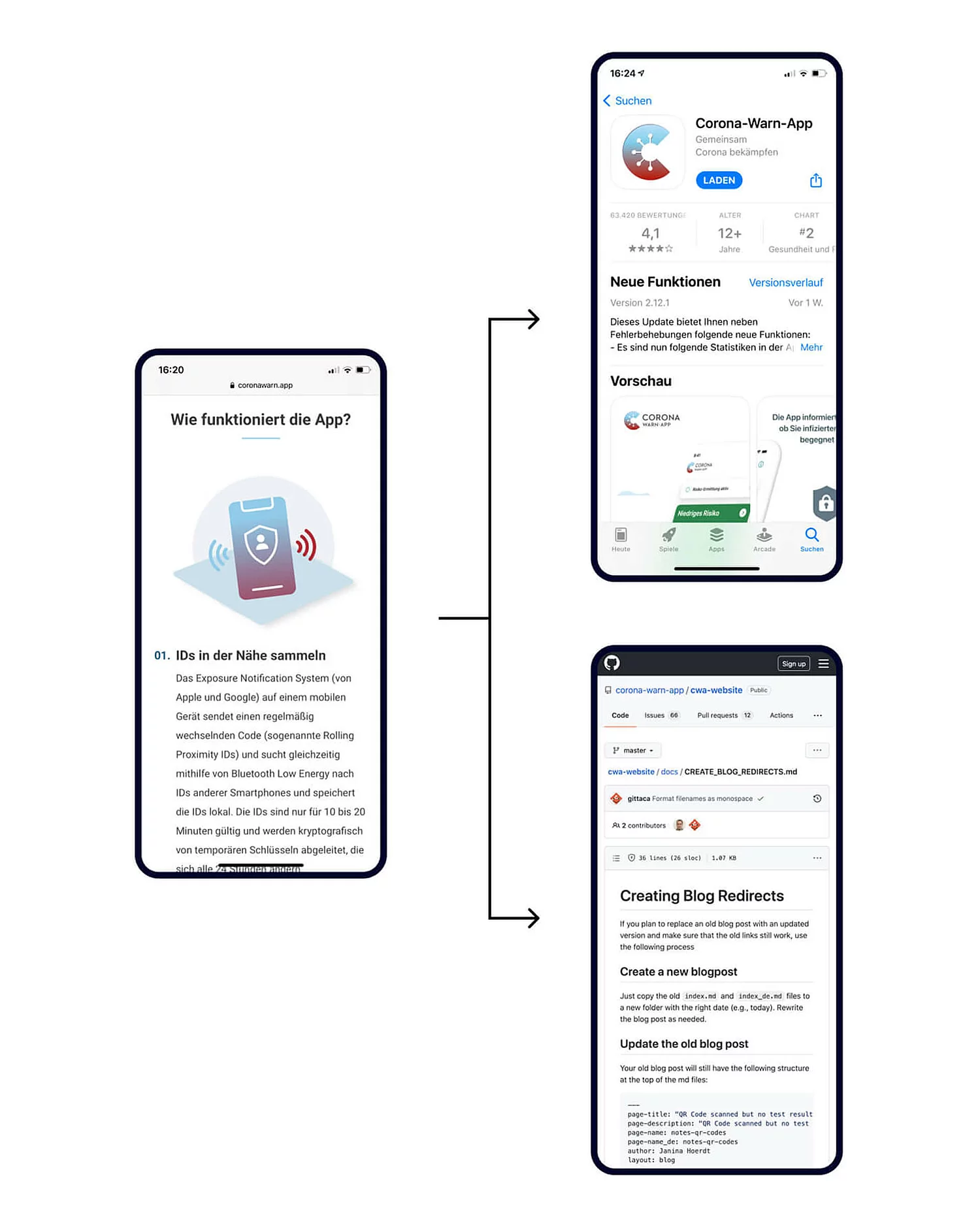
ONE APP, TWO USER JOURNEYS


The first extension: The user blog
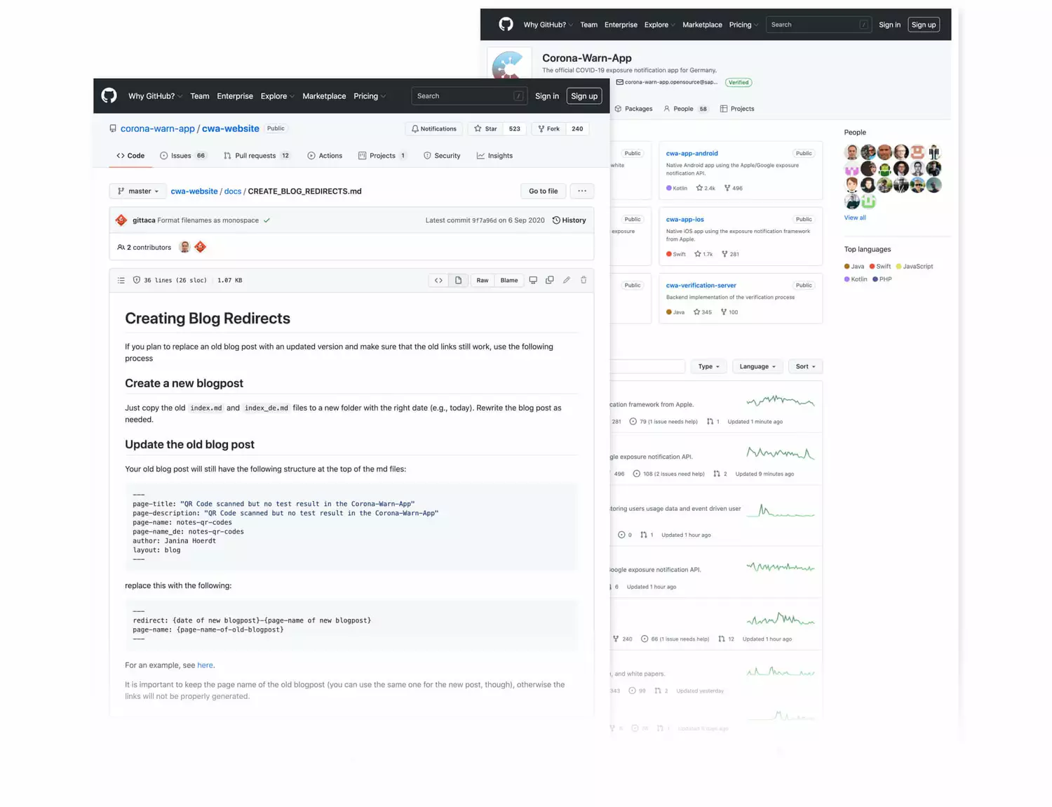
To further strengthen the community spirit of the app, we are integrating a blog for user-generated content, or UGC for short. Technically, this is done via GitHub, one of the most popular developer platforms for open source applications. To make it as easy as possible for people without programming skills to participate, we create a detailed, user-centric guide. The blog is rounded off with a sharing option for page administrators.
The second extension: The analysis dashboard
In the analysis dashboard, interested parties can find the most important data around the Corona warning app. We are responsible for designing the user interface of this new tool. For this purpose, we defined in joint workshops with the experts from the Robert Koch Institute which information should be displayed in which form. The result: an intuitive user interface that bridges the gap between scientific precision and user-friendly overview.
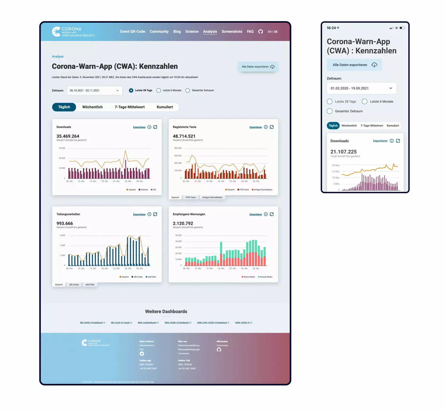
The data shown in the dashboard is fed directly from the app operator T-Systems. This is made possible by an interface that we have set up ourselves. In addition, our developers are programming a function that allows users to export individual statistics.