Celonis: intuitive UI design for complex software
Our user-centred interface helps users keep track of everything so the dashboard doesn’t become a data desert.
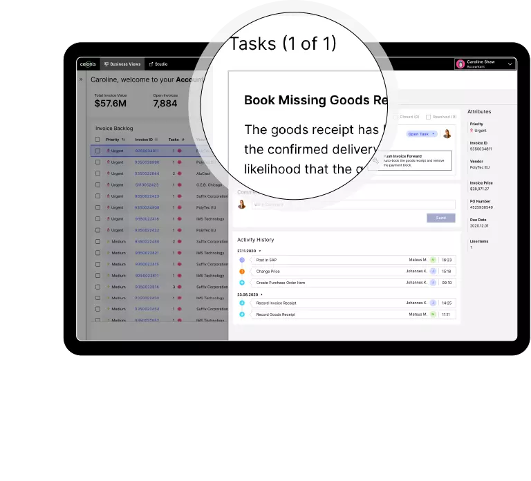
From dashboard to application
A decacorn specialising in process mining: the software created by our customer Celonis provides detailed data on almost all the business processes that go on within an organisation. We ensure that despite being provided with this huge amount of information, users never lose sight of their goals.
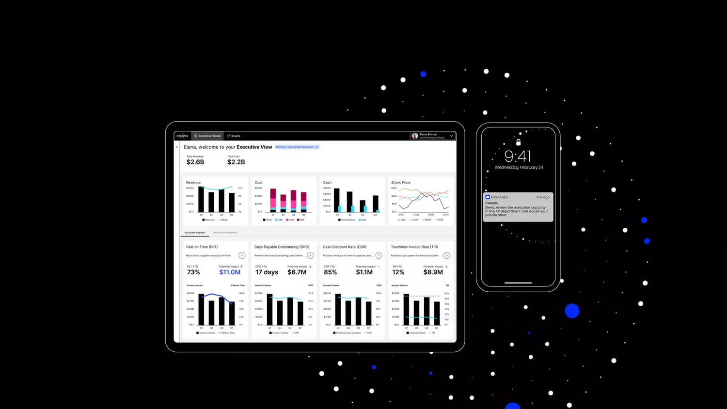
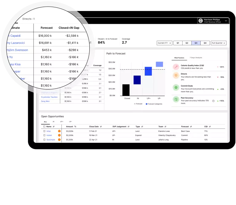
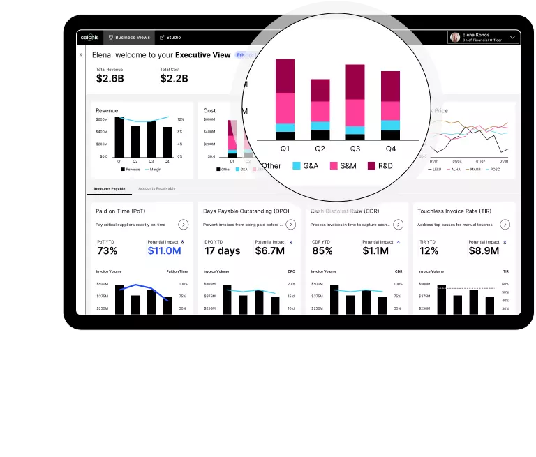
The Celonis executive management system (EMS) allows organisations to analyse and optimise standard business processes in sales, accounting, etc. Thanks to this software, the US cable provider Comcast achieved savings of 71 million euros.
It’s a powerful tool, but the sheer amount of information can overwhelm users. This is where we come in: we designed the software’s user interface, striking a balance between visual appeal and a user experience that is as user-friendly as it gets.
What makes a good user interface?
Complex processes presented in a simple way: to achieve this goal, we and the Celonis product management team took a deep dive into each corporate division that uses the software.
The right priorities
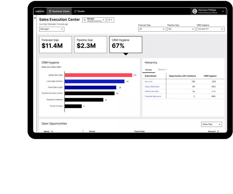
Which figures do sales staff need to evaluate their sales pipeline? Which data are essential for efficiently organising accounts payable – and which aren’t? Working closely with the Celonis product management team, we identified the key figures for each department.
Our objective: to pare everything back to the essentials. We wanted to make sure that Celonis dashboards make getting started as easy as possible by providing users with a quick initial overview – an overview that doesn’t overwhelm.
Tailored user flows
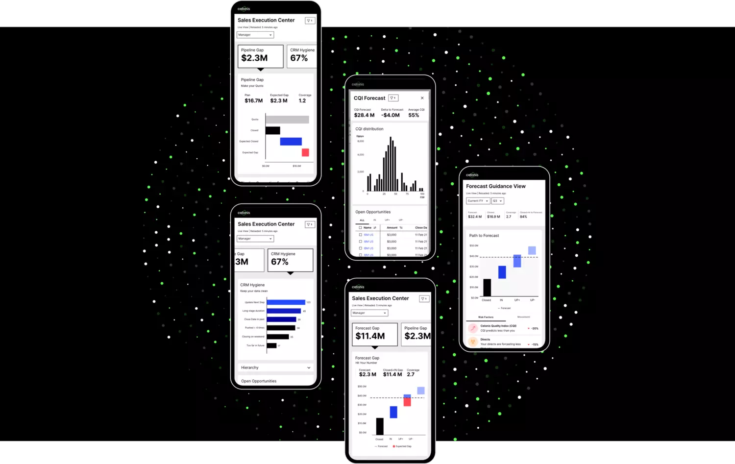
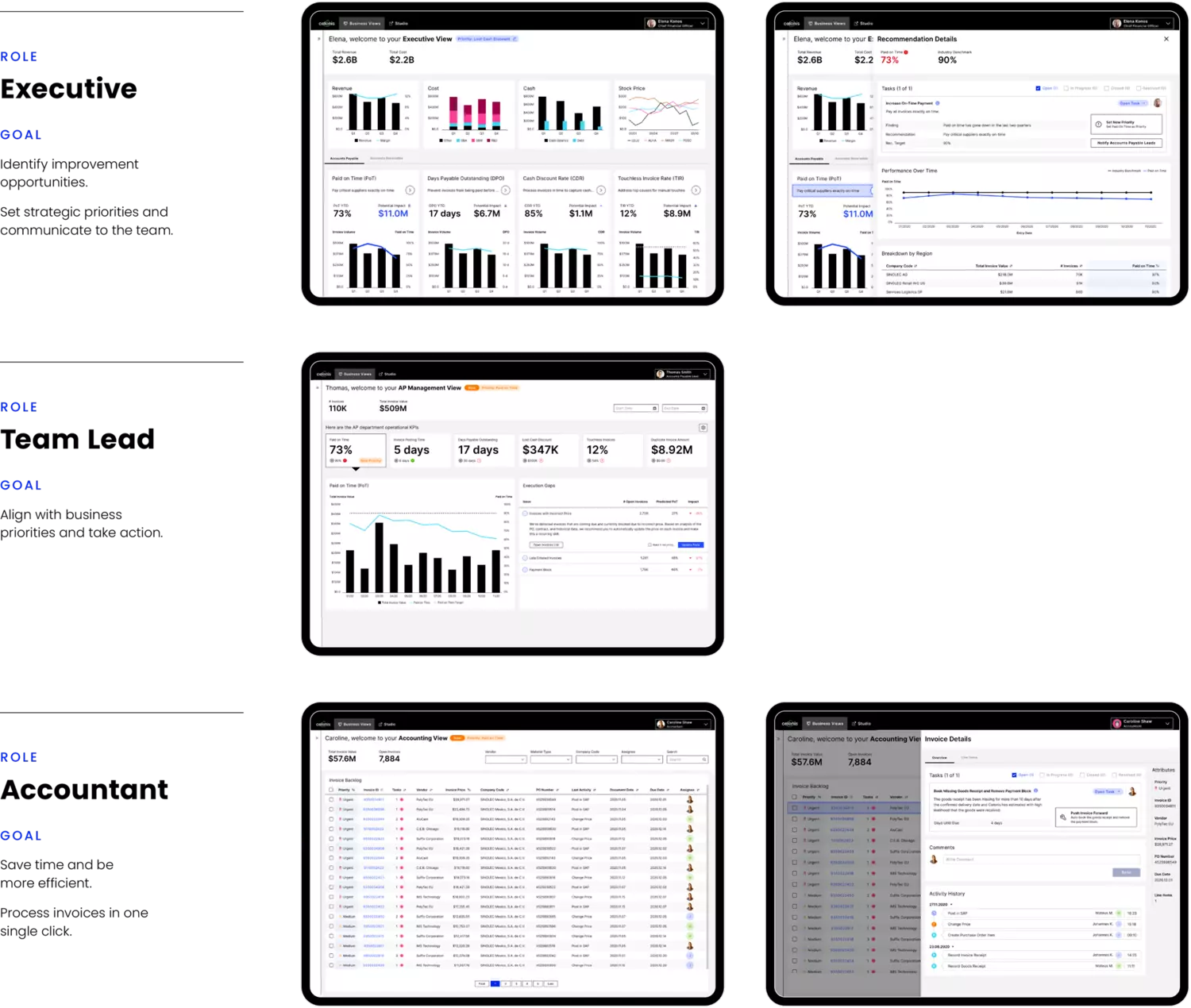
The information a user needs depends partly on his or her role within the company. Managers look at processes differently from department heads, who in turn are concerned with different key figures from administrative staff.
For each of these three user groups, we created special dashboards with different user flows. Perfectly tailored to the user’s information needs, these dashboards make working with Celonis software as easy as possible.
UI design for optimum usability
A software’s usability is the sum of multiple small details. Our UI designers are experts on all of these.
Typography
We opted for the “Inter” font, which was specifically developed for optimum screen readability.
Figures
We used the “Tabular Figures” feature, which means that all figures have the same width. This makes it easier to present and compare figures in tables.
Colour scheme
Colour accents in tables and graphics help the user quickly identify key content. We selected the colours based on the Celonis brand design, which we also created.
UX components
The placement of the components is as important as their design. By cleverly positioning KPIs, tables and graphics, we created an intuitive user experience.