Celonis: brand experience design for a software pioneer.

Serious yet eye-catching, data-driven but never dull: we develop the visual communication for a decacorn.

celonis key visuals in black and white

Key Visuals

Imagery with collages of photos and illustrations, designed by SNK

Imagery

A photo of teh office design in the new Celonis CI developped by brand agency SNK

Office Design

Photo of new CI at a Celonis Event designed by SNK

Event design

Photo shows Celonis poster in new CI

Campaigns

An example shows the new Celonis CI in print

Editorial

Drag for more

We bring thought leadership to life.

In close collaboration with the Celonis Chief Design Officer, we created a self-assured brand experience design for our client combining the authority of a market leader with the spirit of a tech pioneer.

a collage of an astrounaut with neon green and shining blue colour highlights

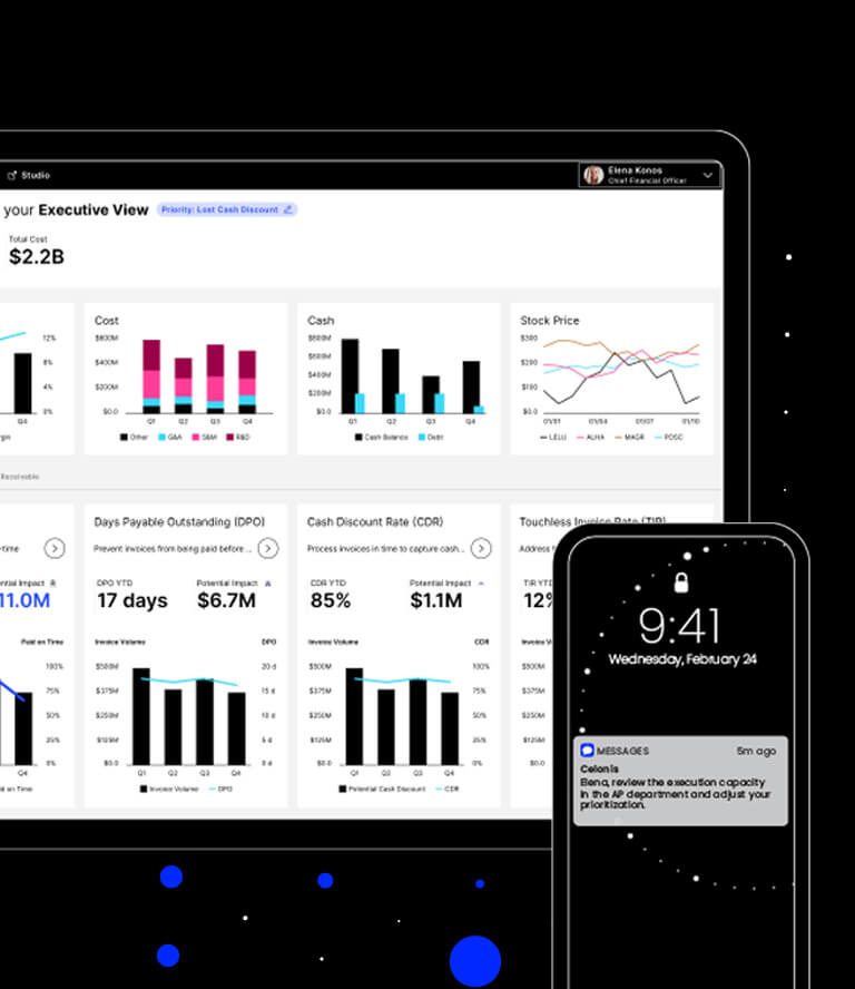
The company’s unique software analyses business processes down to the tiniest detail, revealing inefficiencies and potential savings.

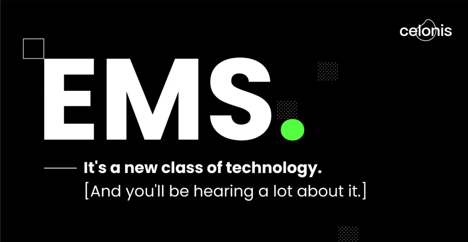
Celonis hired us to relaunch a brand design to coincide with the introduction of the company’s new execution management system (EMS). Our mission: to create a unique visual identity that would bring the brand’s character to life at all customer journey touchpoints, a visual identity with as much impact as the new product itself.

Key information on the project in just three fantastic minutes.

Project objectives

Good brand design doesn’t just look amazing; it also needs to fulfil specific objectives. These were ours:

You can see the brand design of Celonis, which intends to underline the aspect of the thought leader

Emphasise thought leadership

According to the American market research institute Gartner, Celonis is the market leader in process mining software. It was critical that this pioneering position be reflected in the company’s visual identity so that customers can feel they are dealing with a thought leader.

Highlight strategic advantages

The benefits and USPs of Celonis software had to be visually perceptible. The brand design provided the framework for foregrounding the appropriate assets and laid the foundation for the visual product storytelling.

On display is the Celonis brand design, which provides a holistic brand experience

Showcase the brand

The brand design was to be realised across all channels – including the website, the landing pages, online and print ads, and, of course, live digital events – to create a unified brand experience.

Emphasise thought leadership

According to the American market research institute Gartner, Celonis is the market leader in process mining software. It was critical that this pioneering position be reflected in the company’s visual identity so that customers can feel they are dealing with a thought leader.

Highlight strategic advantages

The benefits and USPs of Celonis software had to be visually perceptible. The brand design provided the framework for foregrounding the appropriate assets and laid the foundation for the visual product storytelling.

Showcase the brand

The brand design was to be realised across all channels – including the website, the landing pages, online and print ads, and, of course, live digital events – to create a unified brand experience.

A unique brand experience design

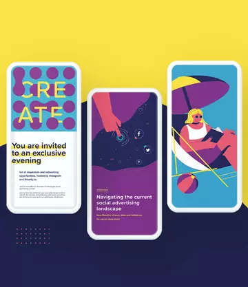
How can colour communicate self-confidence? How can images and graphics convey the benefits of a software platform? Here are just a few examples:

Visual showing a collection of different brand assets

Visual identity: data and its impact

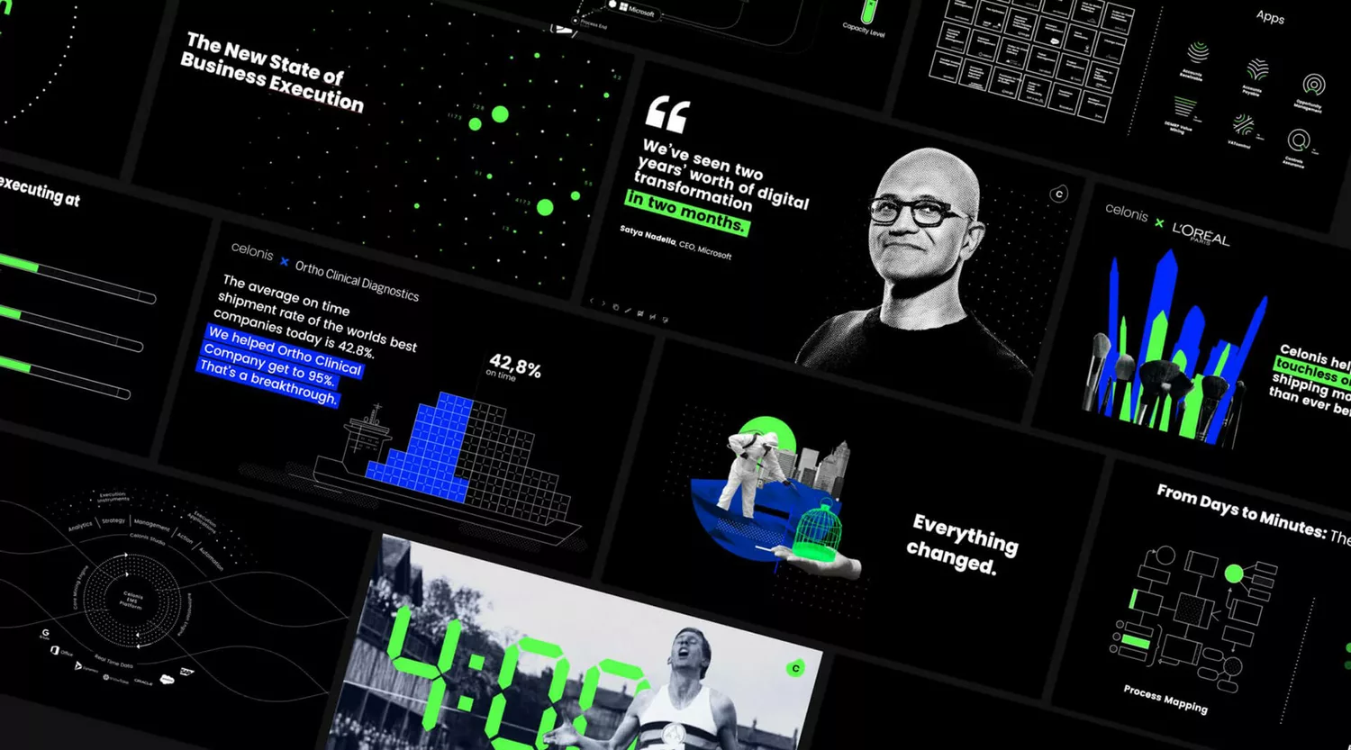
Combining data from different systems and analysing it to discover concrete courses of action – this is at the core of Celonis software. This core is reflected in all our brand assets, with data and the information it provides the central motif of all visuals, graphics and icons. 

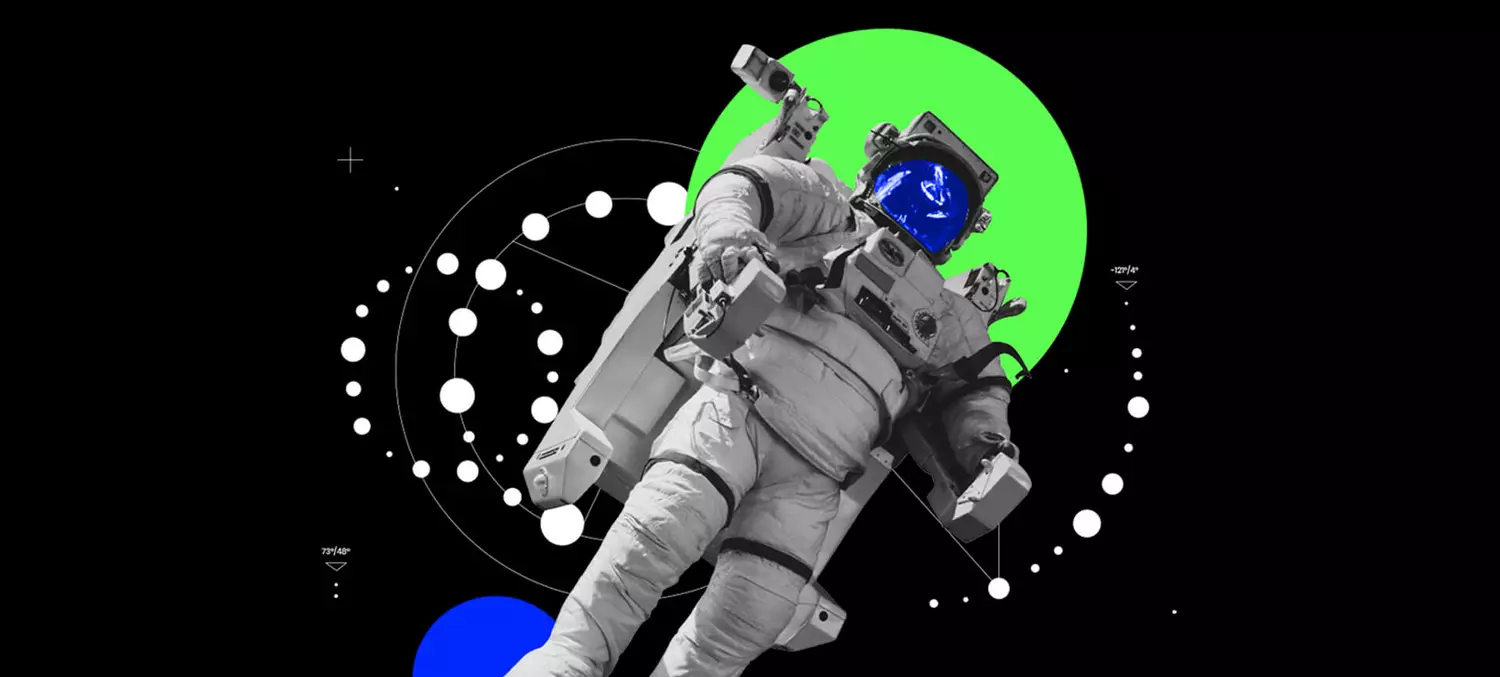
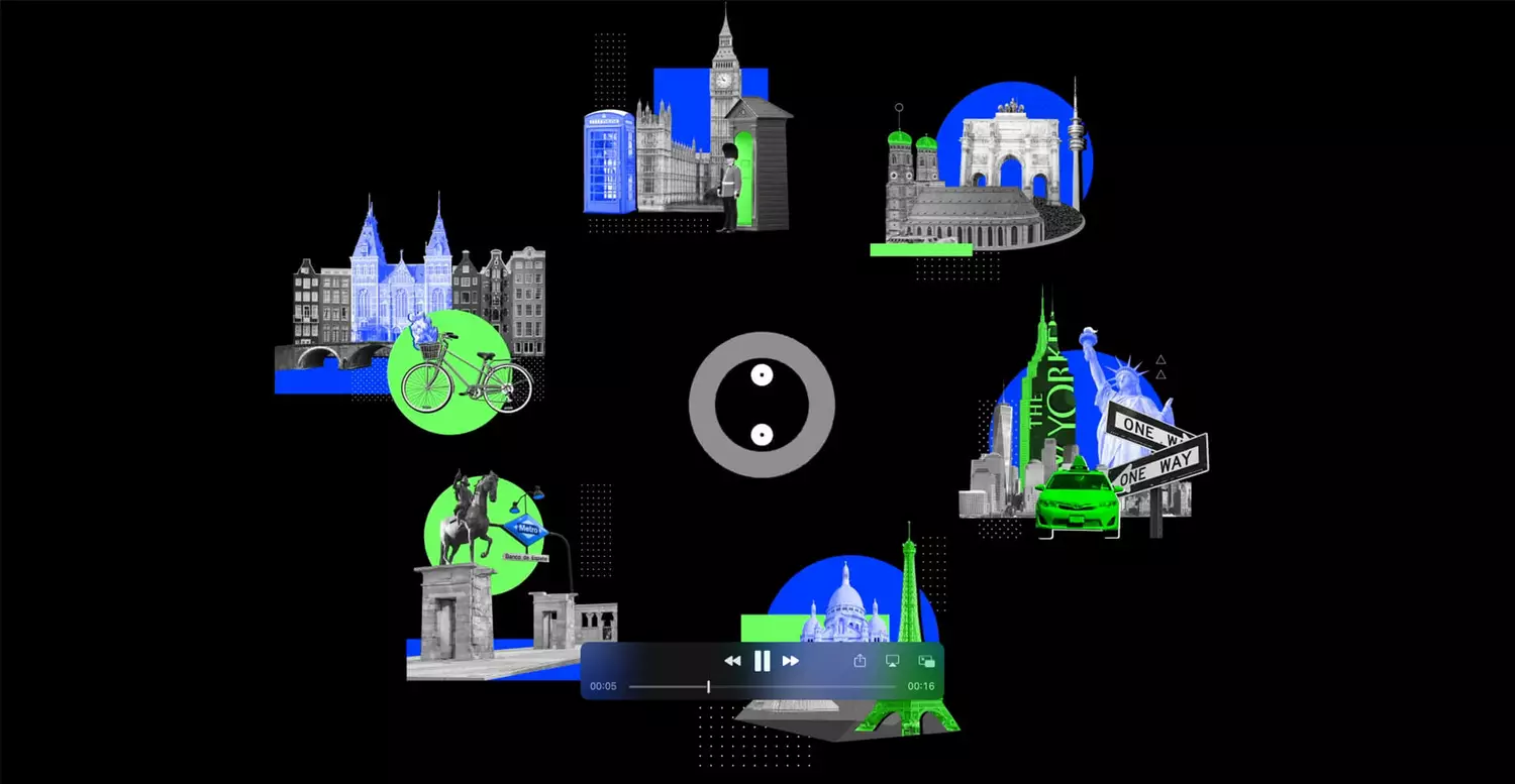
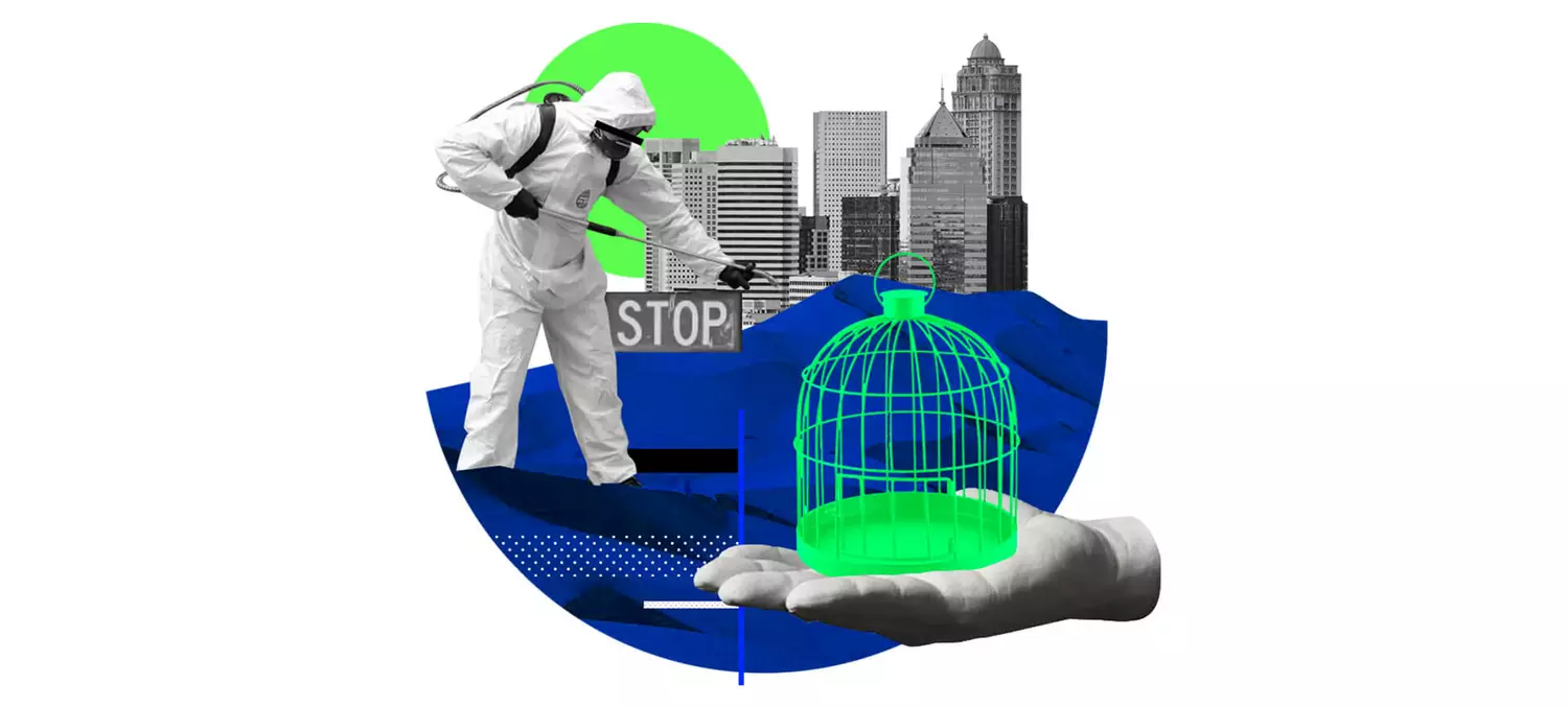
We used collages to link the abstract world of data analysis with its influence on daily business. This makes the Celonis brand and its product more accessible to less tech-savvy target groups.

Visual, that combines black and grey buildings and people with neon green highlights

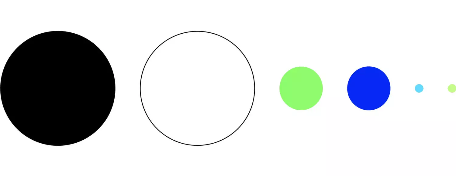
Colour palette: serious, bold, distinctive

“In black and white” is shorthand for clear, precise communication. We chose these two primary colours to highlight the brand identity: serious, data-driven and always on point. 

The secondary colours green and blue provide the necessary visual stimulation. The interplay of these colours creates a unique look that underscores the brand’s pioneering character. Celonis does things differently from the competition – and it stands out visually too.

colorful circles showing the new celonis brand colors

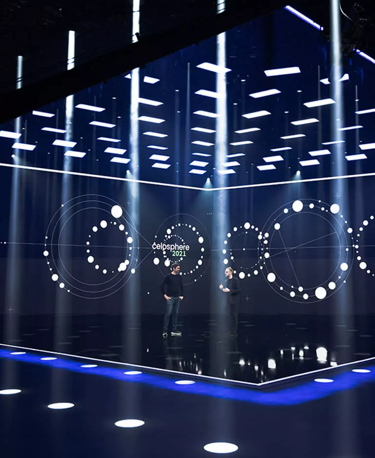
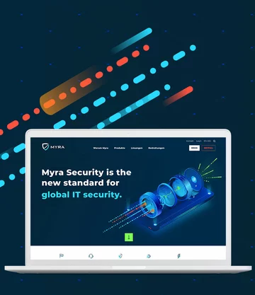
Showcasing the brand at all touchpoints

Our assets and visuals can be found at all touchpoints along the customer journey.

The celonis brand on various devices

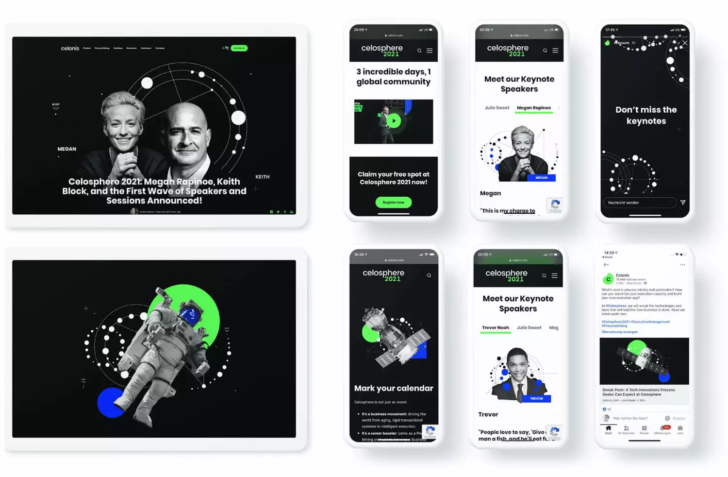
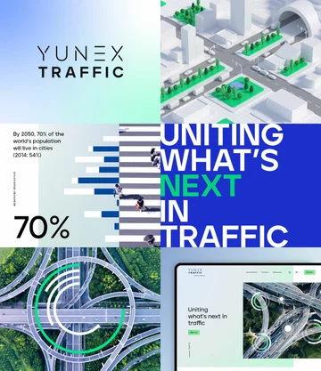
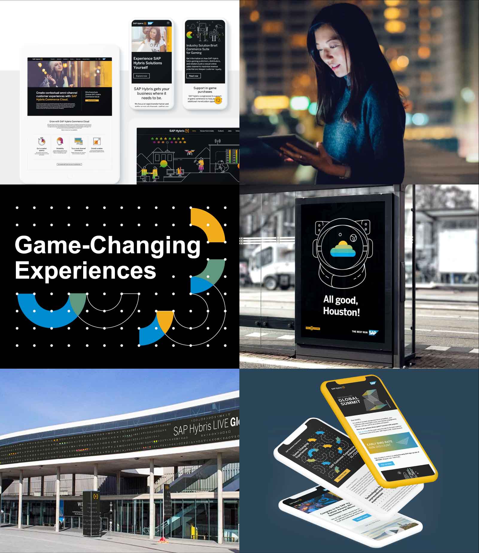
Website, ads, social media: Our brand design is the common thread running through all our digital communication.

We provide the appropriate staging: From the 10-meter stage screen to mailings and online banners, we cover all channels with groundbreaking event design.

Zu sehen ist der 10 Meter Bühnenscreen von Celonis im Event Design von SNK

Live events such as the "Celosphere" and the "Celonis World Tour" are a central part of our client's marketing strategy.

It doesn't just look good on the screen: Our design serves Celonis as the basis for the design of brochures and other print products.

Zu sehen ist ein Buch designt für die Marke Celonis

More projects